 MegaMegaTypeType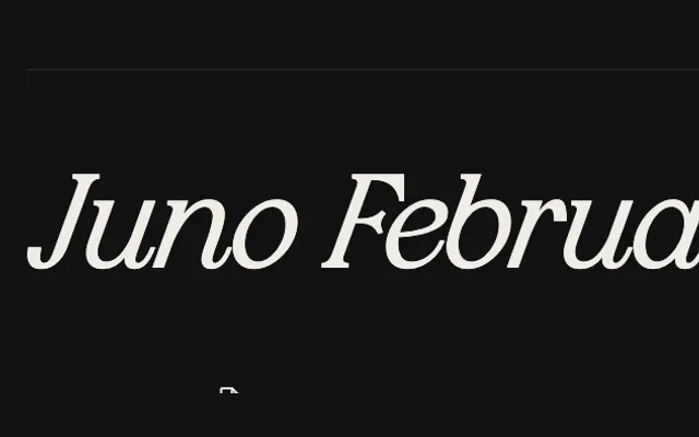
A broad-nib italic serif by Ekaterina Konopleva, rooted in Russian cursive and structured around the continuous gestural logic of handwritten form.
About
Juno Februata derives its letterforms from the movement of a broad-nibbed pen, where diagonal contrast, ink spread in the counters and flowing weight transitions are built on calligraphic continuity. Lowercase letters carry the fluidity of cursive writing through smooth exits, broken loops and mobile ovals, while the capitals impose architectural stability on the same system. Swash alternates extend the gesture naturally, lengthening stroke trajectories and reinforcing the rhythm of the line.
Classification
A broad-nib pen-derived italic serif with diagonal contrast and calligraphic construction rooted in Russian cursive tradition. The design sits firmly in the humanist italic category, with lively stroke modulation, sharp terminals and swash alternates extending the gestural logic.