 MegaMegaTypeType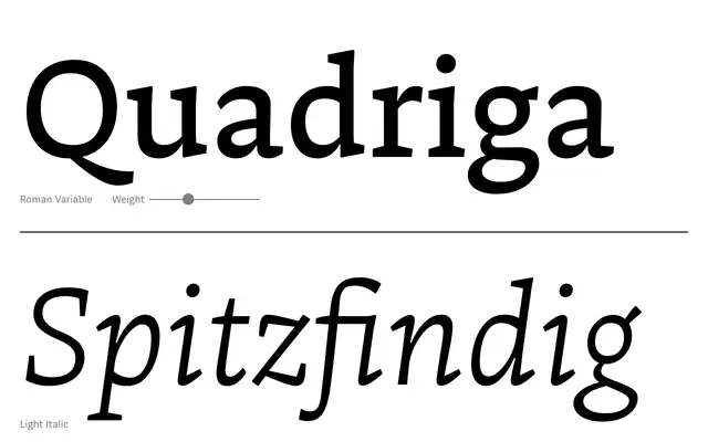
A humanist serif with a slightly reversed stroke contrast, drawn from broad-nibbed pen experiments, available in six weights with italics and variable font support.
About
The slightly reversed contrast shifts emphasis to the horizontal strokes, giving the typeface an unusual flow while keeping classical serif structure intact. Available in 12 styles plus two variable fonts totalling 779 glyphs per style, it suits book and magazine settings where some personality is welcome. The typeface is sold as a work in progress via Future Fonts, with all future updates included in the licence.
Classification
A serif with slightly reversed stroke contrast derived from broad-nibbed pen experimentation, giving it a horizontal emphasis unusual for classical serif forms while retaining their legibility. The organic pen-influenced construction places it firmly in the humanist serif tradition.