 MegaMegaTypeType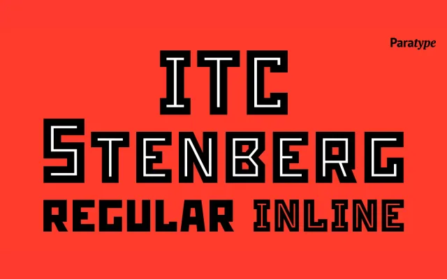
A caps-only geometric display face designed by Tagir Safayev in 1996, drawing directly from Russian Constructivist lettering of the 1920s and 30s and built exclusively from straight lines.
About
Formerly known as Rodchenko, the typeface was renamed after the Stenberg brothers and licensed by ITC in 1997. It offers two styles – Bold and Inline – both constructed entirely without curves, giving them the stark, reductive quality of Avant Garde propaganda graphics. Suitable for advertising, posters and editorial headlines where a strong period aesthetic is required.
Classification
A caps-only geometric sans built entirely from straight lines, rooted in Russian Constructivist lettering of the 1920s–30s. Its purely rectilinear construction and decorative inline variant place it firmly in the display category.