 MegaMegaTypeType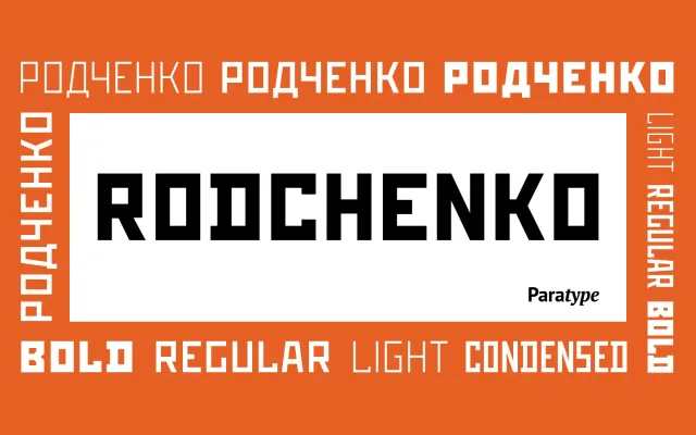
A caps-only geometric sans drawn entirely from straight lines, evoking the graphic language of Russian Constructivism and the work of Rodchenko, Stepanova and the Stenberg brothers.
About
Designed at ParaType between 1996 and 2002, the typeface takes its cues from the agitprop typography of the Soviet avant-garde, stripping letterforms down to their most elemental straight-line geometry. The family spans three weights in standard and condensed widths, with small caps and alternates available. Suited to poster, advertising and display use where a bold historical reference is required.
Classification
A caps-only geometric sans built exclusively from straight lines, drawing directly on Russian Constructivist graphic language of the 1920s–30s. Its extreme simplification and decorative rigidity place it firmly in the display category rather than functional sans-serif.