 MegaMegaTypeType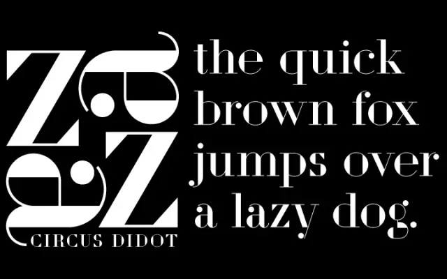
A single-weight display face that dismantles Didot's neoclassical structure using the geometric vocabulary of Russian constructivism and art deco.
About
Danila Orlovsky overlaid basic geometric shapes – triangles, rectangles, circles – onto the contours of Didot letterforms, producing characters that remain legible whilst evoking the paintings of the Russian avant-garde. The result sits at the intersection of Didot rationalism, constructivist lettering experiments and art deco ornament. Released by ParaType in 2010, it suits headline and branding contexts where historical allusion and geometric play are both required.
Classification
A reworked neoclassical serif in a constructivist-geometric idiom, deconstructing Didot letterforms using triangles, rectangles and circles. The extreme contrast and geometric treatment push it firmly into display territory.