 MegaMegaTypeType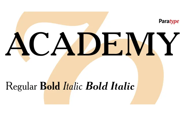
A low-contrast text serif with roots in the Berthold type foundry's St. Petersburg branch, tracing its lineage through Cheltenham and Russian 18th-century type.
About
Originally cut around 1910 at Berthold's St. Petersburg foundry, Academy derives from Sorbonne (Berthold, Berlin, 1905), itself a reworking of Cheltenham by Goodhue and Benton. The digital version was produced at Polygraphmash in 1989 by Lyubov Kuznetsova, with subsequent corrections and extensions by Vladimir Yefimov at ParaType through the 2000s, culminating in a reworked release with Bold Italic in 2009 and a small caps extension in 2013.
Classification
Low-contrast text serif with historical flavour, rooted in the Cheltenham lineage via Berthold's Sorbonne and Russian 18th-century type traditions. Its moderate stroke contrast and sturdy construction place it firmly in the transitional category.