 MegaMegaTypeType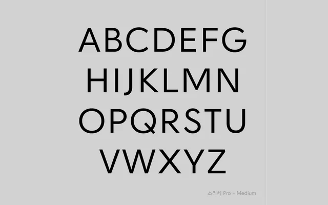
A geometric Hangul typeface designed to phonetically transcribe foreign sounds not native to Korean, introducing new letters derived from the foundational principles of Hunminjeongeum.
About
Conceived as a graduation project in 2005 and released in Pro form in 2021, Sori Pro includes 'Sae-Hangul' — newly designed letters for sounds such as f, l, r, v and z — alongside revivals of obsolete characters like Bansiot and Arae-a. The letterforms follow the Gahoek and Habja principles of Hunminjeongeum, yielding a geometric structure of circles, verticals and diagonals, optically adjusted for continuous reading. The new Hangul characters are accessed via OpenType multi-glyph support in Adobe software.
Classification
Sori Pro is a geometric Hangul typeface structured around horizontal, vertical, diagonal and circular forms inspired by the early Jeongeum style of Hunminjeongeum. Its letterforms are optically corrected for body text use while retaining a geometric rigidity.