 MegaMegaTypeType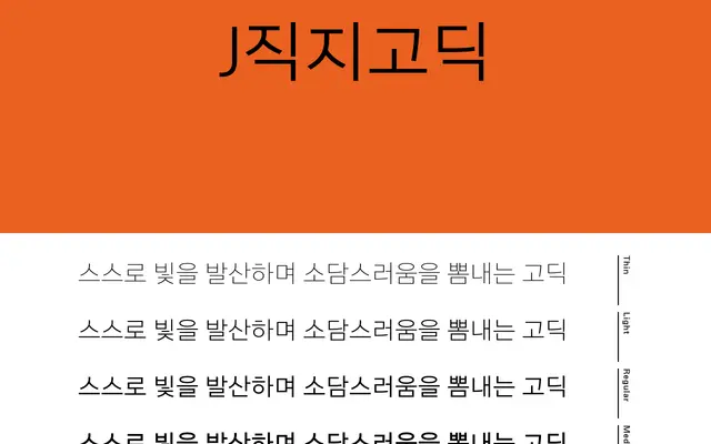
A seven-weight Korean gothic typeface optimised for body text, distinguishing itself through asymmetric stroke descenders on characters such as ㅅ, ㅈ and ㅊ rather than the conventional symmetrical forms.
About
Designed with careful attention to tracking and spatial distribution, 직지고딕 prioritises familiarity and legibility for sustained reading. Its seven weights – from Thin to Heavy – give editorial and graphic designers a broad range of options within a single coherent family. The asymmetric treatment of certain stroke terminals offers a subtle point of differentiation from standard Korean gothic conventions, while the extensive glyph set covers 11,172 Hangul characters, 4,888 Hanja and 986 special characters.
Classification
A Korean gothic (고딕) typeface designed for body text use, combining humanist spacing principles with asymmetric stroke terminals on characters such as ㅅ, ㅈ and ㅊ, placing it firmly in the sans-serif gothic tradition common to Korean type design.