 MegaMegaTypeType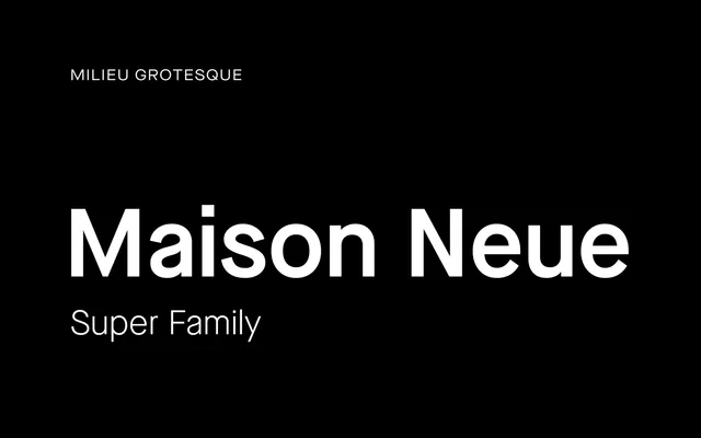
Timo Gaessner's 40-style neo-grotesque superfamily, redrawn from the original Maison with optical refinement as its governing principle – spanning standard, extended and mono widths across five weights with matching italics.
About
Maison Neue began as a typeface for a Berlin architectural practice before Gaessner expanded it into a 40-style superfamily for Milieu Grotesque, with the major revision landing in 2017. The redesign discarded the modular rigidity of the original Maison in favour of a more optically resolved grotesque – one shaped by attention to rhythm, harmony and flow. Three width variants cover standard, extended and mono settings, each carrying the full weight range with italics, with Cyrillic and Vietnamese support added in 2020.
Classification
Neo-grotesque sans-serif redrawn from the earlier Maison typeface, moving away from geometric rigidity toward optically resolved letterforms guided by harmony, rhythm and flow. Closer in sensibility to mid-century European grotesques than strict Swiss rationalism. The 2017 superfamily expansion brought three widths – a subtly condensed standard, an extended counterpart and a mono-spaced variant – with five core weights plus additional cuts (two lighter, two heavier), and matching italics throughout. Cyrillic and Vietnamese support added October 2020. Now owned by Monotype.