 MegaMegaTypeType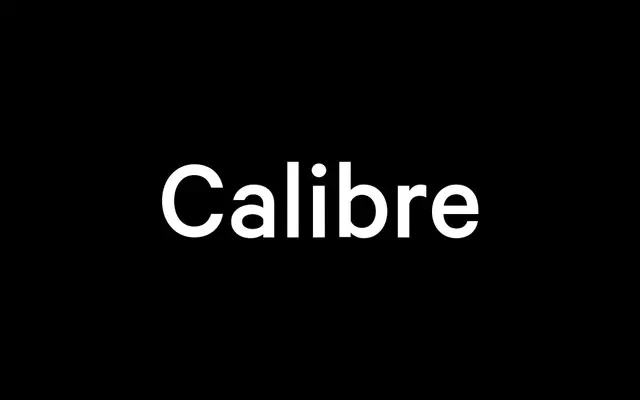
A geometric neo-grotesque by Kris Sowersby that channels the rationalist precision of Aldo Novarese's Recta, sharpened into a crisp, contemporary workhorse available in seven weights.
About
Designed by Kris Sowersby and released in 2011, Calibre takes the rationalist logic of Nebiolo's late-1950s Recta as its starting point, correcting that typeface's awkward branching and optical over-corrections into something leaner and more precise. It shares an underlying geometric framework with its sister face Metric but diverges at the letterform details, landing firmly in the rationalist camp of the neo-grotesque tradition. Running from Thin to Black with matching italics across all seven weights, it is a thorough workhorse equally at home in editorial, UI and corporate settings.
Classification
Geometric neo-grotesque in the rationalist tradition. Draws directly from Aldo Novarese's Recta (Nebiolo, late 1950s), refining its logic without its original optical over-corrections. Shares a fundamental geometric skeleton with its sister typeface Metric, but applies sharper, more rationalist letterform finishes where Metric opts for humanist softness. Classified as Modern Lineal / Neo-grotesque.