 MegaMegaTypeType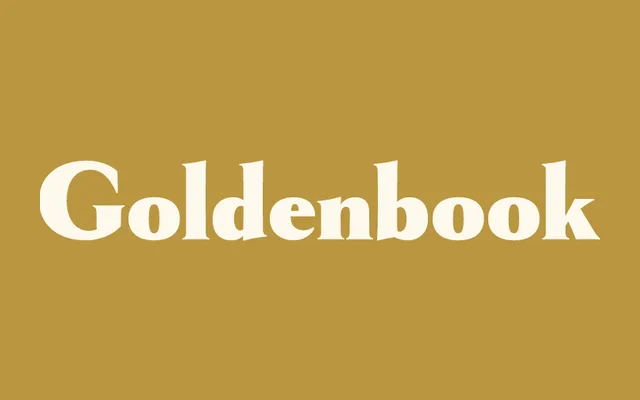
An art deco reinterpretation of a late-1920s magazine logotype, built out from just a handful of surviving letters into a full six-weight family.
About
Goldenbook started from the logotype of The Golden Book Magazine, a literary title from the late 1920s. Simonson describes it as an art deco take on classic roman letterforms, something like an art deco Trajan with a lowercase added. Since only the logotype letters existed to work from, the rest was drawn to feel period-accurate rather than as a straightforward lettering-artist's invention.
Classification
An art deco take on classic inscriptional roman capitals with an added lowercase, closer to serif than display given its Trajan-style letter construction.
Weights
LightRegularBoldExtra BoldHeavyBlack
Languages
Latin Extended
Tags
art-decoinscriptionaldisplayelegantbook-cover