 MegaMegaTypeType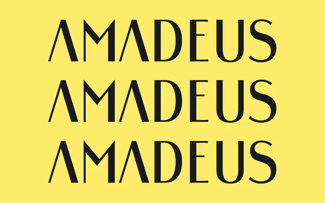
A single-weight display sans by Dirk Heider, designed in 2015 with pointed forms and rough edges drawn from musical notation symbols.
About
Subtle references to music notation are woven into the letterforms through sharp, angular shapes rather than literal symbol borrowing, giving the face a distinctive edge. OpenType features include stylistic alternates for umlauts, oldstyle and lining figures, and a broad Latin language support covering over 100 languages. It is offered as a single style, making it most suited to display and headline use.
Classification
A single-weight display sans with rough edges and pointed forms drawn from musical notation symbols. Its decorative, character-driven construction places it firmly in the display category rather than functional text type.