 MegaMegaTypeType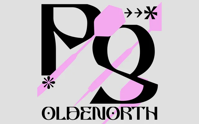
A single-weight decorative display face from Utrecht, defined by its unusually low cap height, flat glyph surfaces and the tension between rounded forms and sharp, pointed stroke endings.
About
Oldenorth pairs rounded letterforms with angular, pointed strokes, a combination that sits somewhere between geometric and gothic without fully committing to either. Its low cap height and idiosyncratic glyphs, notably the m and k, mark it firmly as a display face. At 309 glyphs with Latin European coverage, the character set is respectable for a novelty single-weight release.
Classification
Single-weight decorative display face. Low cap height and flat glyph surfaces are the defining structural traits. Rounded forms paired with sharp, pointed stroke endings give it a gothic-adjacent mood without committing to blackletter construction.