 MegaMegaTypeType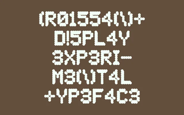
A single-weight display typeface in which each letterform converges inward toward its own centre, drawn from the symbolic concept of the Axis Mundi.
About
Croissant Display is built around a centripetal structural conceit – letterforms that draw inward toward their own centre, giving the type a gravitational, almost hypnotic quality. The design takes the Axis Mundi as its conceptual anchor, merging symbolic geometry with industrial and digital influences. With 189 glyphs including alternates, it suits short display runs and headline contexts where visual distinctiveness matters more than readability.
Classification
Single-weight display font with centripetal letterforms – each character draws inward toward its own centre. The design concept references the Axis Mundi, blending symbolic geometry with industrial and digital aesthetics. Not a conventional display cut; the centripetal structure limits legibility at smaller sizes and restricts versatility.