 MegaMegaTypeType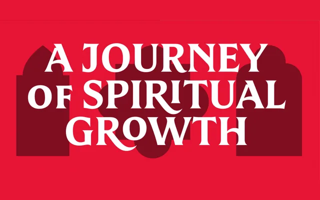
A bespoke corporate serif developed for Eternal Word Television Network, adapted from the Mestiza typeface with reworked uppercase proportions to establish a distinct typographic identity across broadcast, digital and print.
About
Commissioned by EWTN and art directed by Sam Zamarron, Guadalupe began as an adaptation of Mestiza before diverging through systematic adjustments to uppercase waistlines, lending the letters a stronger sense of authority. Key glyphs such as the /G/, /J/, /M/ and /A/ received particular attention for their symbolic resonance within the organisation's identity. Intended for use at 14 pt and above in headlines, titles and short phrases, the family spans websites, broadcast media, apps, e-publications and social media imagery.
Classification
Derived from Mestiza, a humanist serif, Guadalupe is a custom corporate serif with adjusted waistlines and distinctive uppercase letterforms designed for display use across digital and broadcast platforms.