 MegaMegaTypeType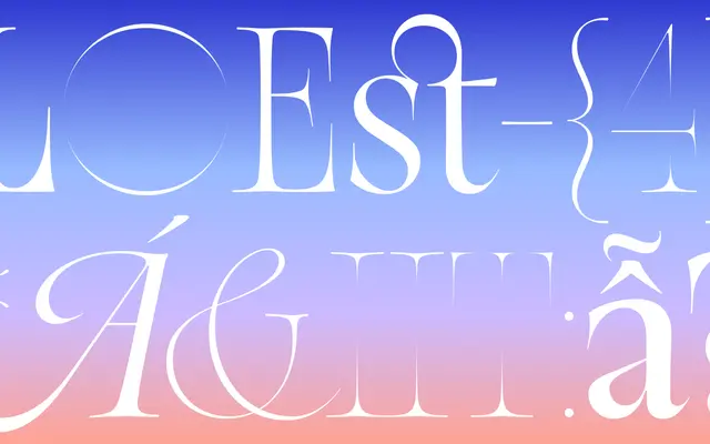
A high-contrast display serif with sweeping, organic strokes drawn from the forms of stalactites and stalagmites.
About
Loes uses Roman letterforms as its foundation and introduces high-contrast, flowing strokes drawn from mineral formations rather than calligraphic sources. The x-height narrows progressively from Thin to Bold, keeping letterforms optically consistent across the range at large sizes. At 600+ glyphs covering extended Latin and Vietnamese, it was recognised by the Type Directors Club in 2024.
Classification
A high-contrast display serif with organic, sweeping strokes modelled on stalactites and stalagmites rather than the calligraphic pen tradition. The x-height is tightened progressively from Thin to Bold – an intentional structural decision for display legibility at large sizes. Recognised by the Type Directors Club in 2024.