 MegaMegaTypeType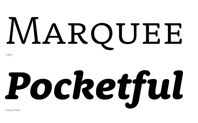
An old-style serif with rounded, organically soft curves that balance legibility with warmth across six weights and matching italics.
About
Rooney Pro is built on old-style construction principles – diagonal stress, open apertures and moderate contrast – giving it a grounded, serious character. Its distinguishing quality is the integration of rounded forms and soft curves directly into the letter structure, rather than as a superficial treatment. The result is a versatile family suited to editorial work, book typography, corporate identity and packaging, available in 838 glyphs per style across 12 styles.
Classification
Old-style serif construction with diagonal stress, open apertures and medium contrast, softened by rounded curves integrated organically into the letterform structure rather than applied as decoration.