 MegaMegaTypeType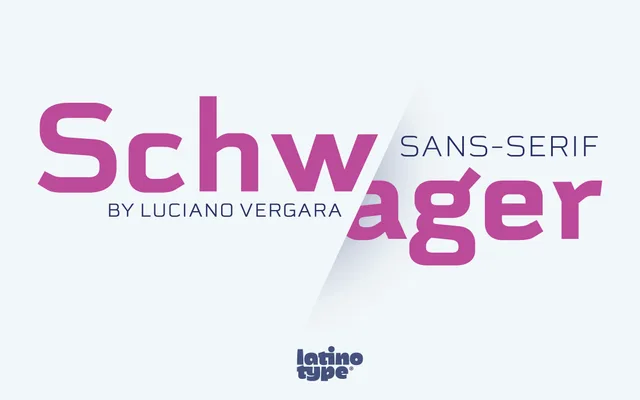
A geometric sans-serif by Luciano Vergara that reinterprets the structure of its predecessor Schwager with a modernist, display-oriented sensibility across six weights with matching italics.
About
Schwager Sans updates the original Schwager with a cleaner, more contemporary take on geometric structure and modernist aesthetics. Six weights from Thin to Black, each with an italic companion, give the family flexibility across titling, logo and cover applications. The design leans into associations with technology and sport, favouring boldness over neutrality.
Classification
A geometric sans-serif with modernist structure and clean forms, designed with a strong geometric basis suited to display use in titles and logos.
Weights
ThinLightRegularMediumBoldBlack
Languages
Latin
Tags
geometricmodernistdisplaytitlinglogosportstechnologymasculine