 MegaMegaTypeType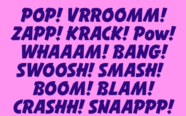
An energetic inclined titling sans inspired by 1960s poster brush lettering, positioned as a modern alternative to classics like Balloon or Banco.
About
Globo grew from a single sketch of bold uppercase poster lettering found in a 1960 handbook for commercial artists. Though its roots are in brush lettering, the letterforms were given a solid, sturdy structure that reads as a proper sans rather than a script, making it a contemporary counterpart to brush-lettering classics. It suits sports, kids' products, food branding, music and streetwear work.
Classification
An inclined titling sans built from brush-lettering research, developed as a more contemporary alternative to brush-script classics like Balloon or Banco while keeping the sturdy structure of a sans.
Weights
ThinLightTextRegularMediumSemiBoldBoldExtraBoldHeavy
Languages
Latin Extended
Tags
sans-seriftitlingbrush-inspiredsportspackagingstreetwear