 MegaMegaTypeType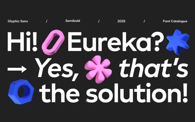
A geometric sans with humanist inflections from four Latinotype designers, aimed at fintech and technology branding across eight weights with matching italics.
About
Glyphic Sans sits between geometric rigour and humanist warmth, with distinctive detailing concentrated in characters such as K, Q, y and k, where extended strokes and elegant diagonals give the family its personality. Eight weights from Thin to Extrabold, each with an italic, make it equally usable in logotypes and longer editorial or interface settings. Originally conceived for short wordmarks, it maintains legibility and visual rhythm across corporate and digital applications.
Classification
Built on geometric proportions with humanist inflections, visible in the extended strokes and diagonals of characters like K, Q, y and k. The blend places it between a pure geometric and a humanist sans-serif.