 MegaMegaTypeType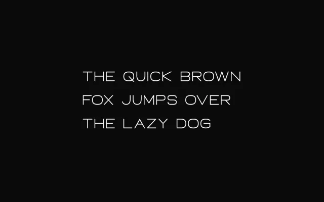
A geometric sans-serif in seven weights with matching italics, designed for branding and digital interface work with a clean, minimal character.
About
Built on precise, even-weighted geometry, Neon offers 14 styles across seven weights from Thin to Heavy, each with an upright and italic cut. The Latin Extended Pro character set covers Western, Central, Baltic, Nordic and South-Eastern European languages. Its straightforward construction suits technology branding, editorial layouts and poster work.
Classification
A clean geometric sans-serif built on minimal, regular forms with a futuristic character. The even stroke weight and precise geometry place it firmly in the geometric sans tradition.
Weights
ThinLightRegularMediumBoldExtraBoldHeavy
Languages
Latin
Tags
geometricminimalfuturisticbrandingdigitalcontemporarytechnologyeditorial