 MegaMegaTypeType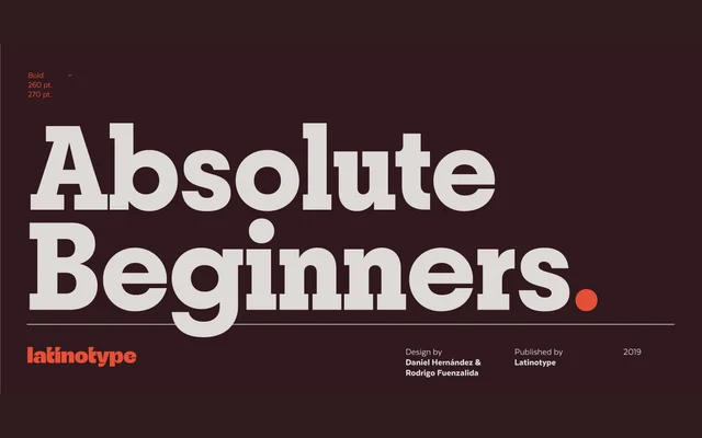
A geometric slab serif from Latinotype with a distinctive rhythm created by the pronounced size contrast between rounded and rectangular letterforms, spanning 10 weights with matching italics.
About
Designed by Daniel Hernández and Rodrigo Fuenzalida and released in 2019, Breton draws inspiration from Boston and is built around a deliberate proportional tension: rounded characters such as 'o', 'c' and 'e' are considerably wider than their rectilinear counterparts. This contrast gives compositions an unusual cadence suited to headings and branding work. Each of the 20 styles covers 417 glyphs with support for over 200 Latin-based languages.
Classification
Geometric slab serif with pronounced contrast between rounded and rectangular letterforms, following a modernist geometric construction. The strong personality and branding focus align with the geometric slab tradition.