 MegaMegaTypeType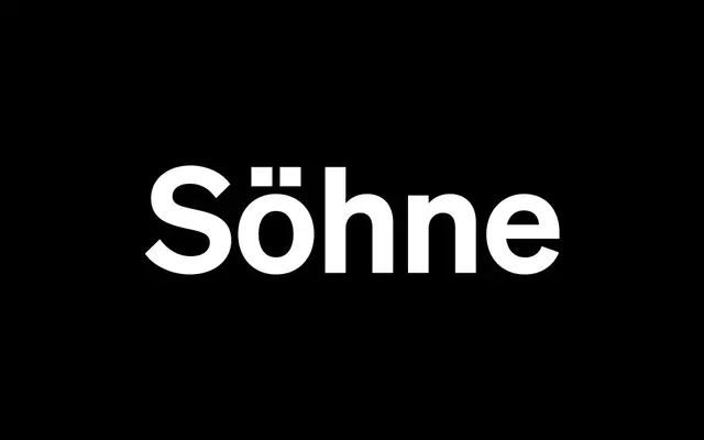
A neo-grotesque drawn from the memory of Akzidenz-Grotesk as used in the NYC Subway, recast through Helvetica's proportions by Kris Sowersby in 2019.
About
Söhne was designed outward from Akzidenz-Grotesk's Halbfett rather than a regular weight, capturing the tight spacing, low contrast and angled terminals of mid-century subway signage without attempting a literal revival. The family spans eight weights with italics across four sub-families: a standard cut, a wide Breit, a condensed Schmal, and a Mono variant that adds serifs to narrow characters to maintain legibility at fixed pitch. It won the Red Dot Award Best of the Best in Typography in 2020 and has become one of the defining grotesques of the digital era.
Classification
Neo-grotesque drawn from the analogue memory of Akzidenz-Grotesk – specifically Standard Medium as used in Unimark's NYC Subway wayfinding system – and recast through Helvetica's proportions. Designed outward from the Halbfett weight rather than a regular. Default 'a' carries a tail; an alternate double-storey 'g' is included, both drawing on related historical grotesks including Breede Halfvette Antieke and Blockschrift. Low contrast, tight spacing, angled terminals.