 MegaMegaTypeType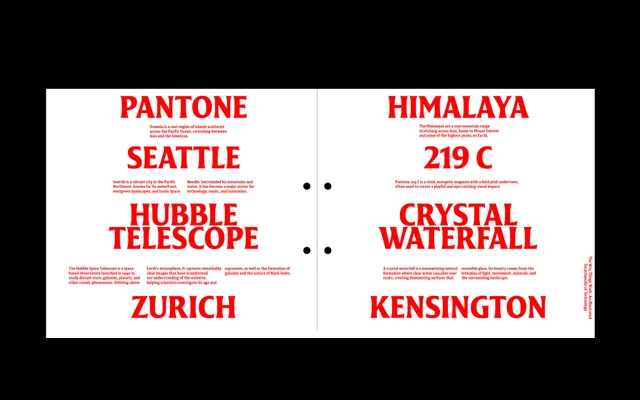
A slightly condensed flared serif by Pauline Fourest, drawn from shop signs and brush lettering.
About
JT Disway has small, pointed flares and narrow proportions that come from sign painting and brush calligraphy rather than book type. Seven weights from Regular to ExtraBlack, each with an italic, run from calm text to heavy headlines. The bolder cuts suit posters, signage and identities.
Classification
A flared serif with small, pointed serifs derived from brush calligraphy and sign-painting traditions rather than classical type history. Slightly condensed proportions and calligraphic detailing place it between a humanist serif and a display inscribed face.
Weights
RegularMediumSemiBoldBoldExtraBoldBlackExtraBlack
Languages
Latin
Tags
flared-serifsignagedisplaycalligraphicsign-paintingcondensedposteridentity