 MegaMegaTypeType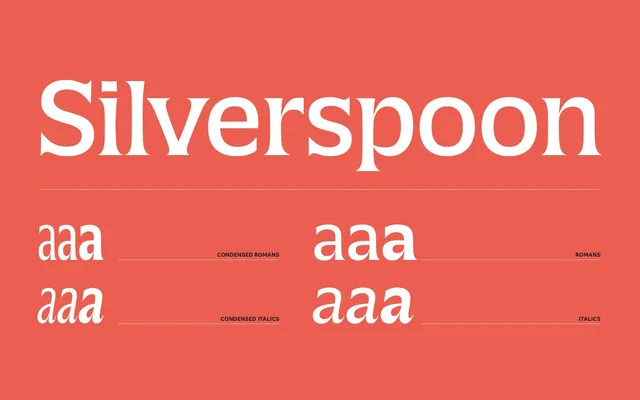
A flared-serif headliner with tight spacing and optional curly alternates, digitised from San Francisco street signage.
About
Silverspoon started as a digitisation of the letters on the Albert S. Samuels Clock in San Francisco, later completed as a multi-width family. Flared serifs and compact vertical proportions make it stable at medium sizes, with curlier alternates and flamboyant italics available for more personality, plus a Condensed cut for headlines and packaging.
Classification
A flared-serif headliner with compact proportions and optional curly alternates, sitting in the flared serif category alongside faces like Present or Bookman.
Weights
LightRegularBold
Optical sizes and widths
StandardCondensed
Family
Silverspoon Condensed
Languages
Latin
Tags
flared-serifheadlinedisplaycurlycondensed