 MegaMegaTypeType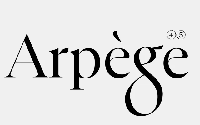
A four-weight contemporary serif drawing on Renaissance calligraphy and Italian editorial tradition, balancing sharp terminals and angled stress with Bodonian verticality.
About
Developed from brush-drawn sketches, FH Anorma takes its name from the Italian phrase meaning 'by the rule', and the discipline shows in its restrained construction. Sharp terminals and angled stress echo Griffo's Roman, while the vertical axis and structural economy recall Bodoni. The four weights – Light, Regular, Medium and Bold – are intended for publishing, branding and identity systems that require formal precision.
Classification
A contemporary serif combining Renaissance calligraphic influence (sharp terminals, angled stress recalling Griffo's Roman) with the vertical axis and structural restraint of Bodoni, placing it between humanist and neoclassical transitional territory.