 MegaMegaTypeType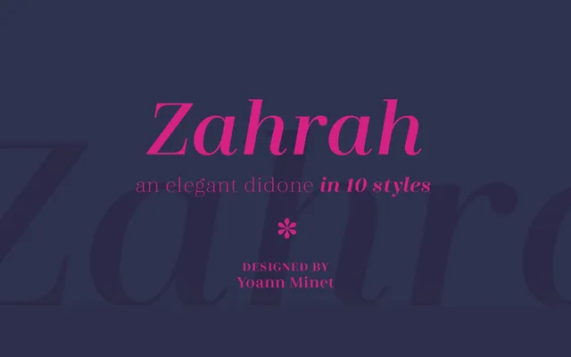
A Didone serif in five weights with true italics, designed by Yoann Minet for versatile use across editorial, fashion and corporate contexts.
About
Zahrah combines the hallmarks of the Didone genre – pronounced thick-to-thin contrast and geometric clarity – with small whimsical details that add warmth to extended text. Five weights from Light to Bold each carry a companion italic, making ten styles in total. The family is suited to a broad range of applications, from magazine layouts and branding to newspaper text and screen typography.
Classification
A Didone-style serif characterised by strong contrast between thick and thin strokes, with geometric clarity and whimsical detailing. Suitable for both display and text applications across a broad range of settings.