 MegaMegaTypeType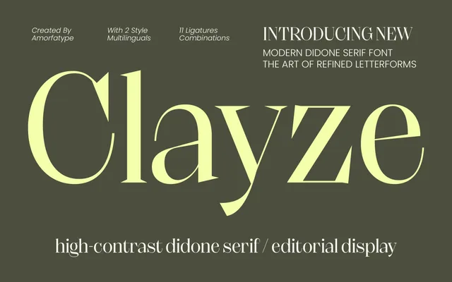
A Didone serif from Amorfa Type pitched at editorial and fashion contexts, built around extreme stroke contrast and refined proportions.
About
Clayze follows the established Didone model with vertical stress, hairline serifs and pronounced thick-thin contrast. It is positioned for editorial, packaging and logotype use where high contrast makes a visual statement at large sizes. The family appears to offer a single style without condensed or italic companions.
Classification
A high-contrast Didone serif with the hallmark vertical stress, hairline serifs and extreme thick-thin stroke contrast characteristic of the tradition originating with Bodoni and Didot.
Weights
Regular
Family
Clayze High Contrast Editorial Serif
Languages
Latin
Tags
didonehigh-contrasteditorialelegantluxuryfashionserifcontemporary