 MegaMegaTypeType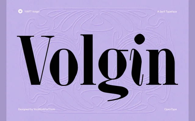
A high-contrast Didone serif spanning nine weights with matching italics and two variable styles, aimed at editorial and luxury applications.
About
Tall, narrow proportions and razor-thin hairlines give YWFT Volgin its characteristic tension, with teardrop terminals on the g and j and sharp bracketed serifs throughout. The family includes 602 glyphs with coverage across Latin, Greek, Baltic, Central European, Vietnamese and Pan African scripts, plus a deep OpenType feature set with oldstyle figures, discretionary ligatures, fractions and scientific inferiors. It moves comfortably between magazine mastheads and luxury packaging without being limited to purely display use.
Classification
A high-contrast Didone serif with vertical stress, tall narrow proportions, razor-thin hairlines and sharp bracketed serifs — hallmarks of the classical Didone model as seen in Bodoni and Didot.