 MegaMegaTypeType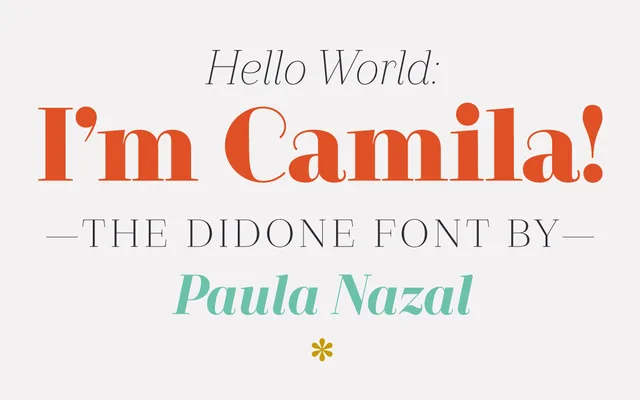
A Didone family by Paula Nazal Selaive, spanning seven weights with italics, distinguished by the absence of teardrop terminals and a soft, refined finish suited to branding and editorial work.
About
Camila takes its conceptual cues from Coco Chanel, aiming for elegance and simplicity within the Didone genre. It departs from convention by replacing teardrop terminals with clean, open finishes, lending the family a lighter and more contemporary character. Seven weights from Thin to Black, each with a matching italic, provide 14 styles covering 206 languages across a 426-character set.
Classification
A Didone typeface characterised by high stroke contrast and thin serifs, though notably departing from the tradition by omitting teardrop terminals. The design sits between classical Didone conventions and a more refined, contemporary interpretation.