 MegaMegaTypeType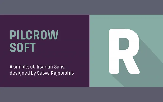
A rounded variant of Pilcrow with softened stroke terminals, designed for screen use and tech branding across five weights without italics.
About
Pilcrow Soft shares its geometric, square-proportioned skeleton with the straight-cornered Pilcrow, but with filed-down terminals that lend a friendlier, more approachable character. The design draws on the visual language of street signage and industrial cast-metal lettering, featuring large counters, deep ink traps at diagonal junctions and proportionally-spaced glyphs with only subtle width variation across the weight range. Italics are deliberately absent, with the family relying on weight contrast alone to establish typographic hierarchy.
Classification
A mono-linear geometric sans with square proportions and rounded terminals, designed for utilitarian and screen applications. Its mechanical, low-contrast letterforms with large counters and deep ink traps place it firmly in the geometric sans tradition.