 MegaMegaTypeType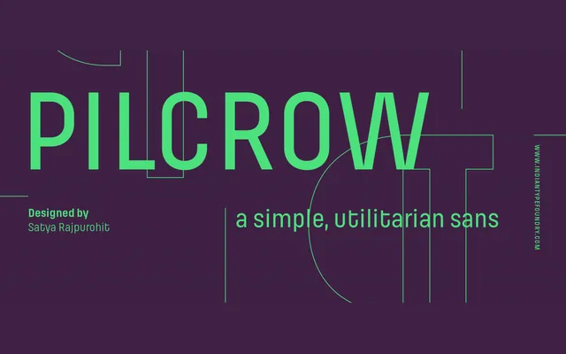
A square-proportioned geometric sans in two versions – sharp-cornered and rounded – designed for signage-style clarity across five weights without italics.
About
Pilcrow draws from cast-metal industrial lettering and highway signage, using large counters, deep crotches and square terminals to achieve high legibility at small sizes and on screen. The Soft variant rounds off stroke terminals to produce a friendlier feel suited to digital product and tech branding. Weight-based hierarchy replaces italics throughout, consistent with the typeface's utilitarian origins.
Classification
A mono-linear geometric sans with square proportions and utilitarian letterforms derived from signage and industrial lettering. The absence of italics and the modular, proportionally-spaced construction place it firmly in the geometric tradition.