 MegaMegaTypeType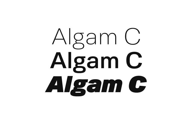
Heavy duty cutie: the squared, hard-working Algam.
About
Algam C squares off the Algam skeleton for a reliable, sturdy feel. The specimen is drill presses and hydraulics. Nine weights with italics, in static and variable form, and it is the base for several Experim-etal fonts.
Classification
The sturdy Algam: squared-off, heavy-duty shapes for industrial settings, nine weights with italics.
Weights
HairlineThinExtraLightLightRegularMediumBoldExtraBoldBlack
Optical sizes and widths
Variable: wght 50–900, slnt 0 to -12
Family
Algam C VF
Languages
Latin
Tags
industrialsquaredgeometricheadlinebrandingvariablesturdy