 MegaMegaTypeType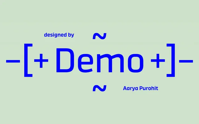
A flat-sided, mono-linear sans with a technoid character, built across five weights with oblique companions and an unusually tall x-height suited to branding and headline work.
About
Though its appearance reads as near-futuristic, Demo's letterforms are rooted in humanist italic construction: the single-storey 'a' and 'g' echo 16th-century Italian chancery scripts. Stroke contrast is entirely absent, lending a consistent industrial quality across all ten styles. The lighter weights are legible enough for short passages of body copy, while the bolder cuts suit display and signage use.
Classification
A flat-sided, mono-linear sans serif with a technoid, near-geometric character. Despite the futuristic appearance, letterforms draw on italic humanist construction, with single-storey 'a' and 'g' referencing 16th-century chancery models.