 MegaMegaTypeType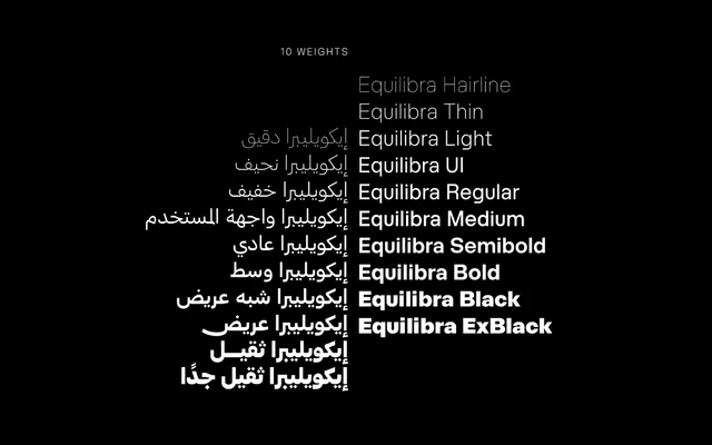
A multilingual geometric sans combining Arabic and Latin scripts across nine weights, softening the rigidity typical of the genre with organic curves and careful attention to Arabic letterform construction.
About
Designed by Muhammed Hadi and released in December 2024, HT Equilibra pairs a geometric structural discipline with warmer, more humanistic curves across both its Arabic and Latin scripts. The Arabic letterforms receive particular attention, with the dynamic form of the ح, the symmetrical balance of ن and the sharp base of م serving as focal points of the design. Nine weights from Hairline to ExtraBlack make it suitable for both headline and body applications across corporate identity, editorial and digital interface work.
Classification
Built on a geometric foundation with humanistic softening, HT Equilibra follows the tradition of geometric sans-serifs but introduces organic warmth in its curves and internal spaces, particularly evident in its Arabic letterforms.