 MegaMegaTypeType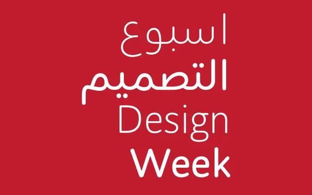
A bilingual Arabic and Latin rounded sans serif in seven weights, designed to balance approachability with professional legibility across branding, signage and editorial contexts.
About
Designed at Tarek Atrissi Design's Barcelona studio — giving the family its BCN acronym — this typeface takes a low-contrast approach with slight modulation at stroke connections, fluid curves and rounded terminals that contrast with sharp intersections. The compact letterforms suit a wide range of uses, from small-text legibility to headline display. Its calligraphic Arabic roots distinguish it from purely geometric rounded designs, occupying a gap in the Arabic type market between childish softness and purely functional sans serifs.
Classification
A low-contrast humanist rounded sans serif drawing on calligraphic Arabic letterforms, with fluid curves, rounded terminals and slight modulation at stroke connections — placing it firmly in the humanist sans category with a distinctly Arabic calligraphic heritage.