 MegaMegaTypeType
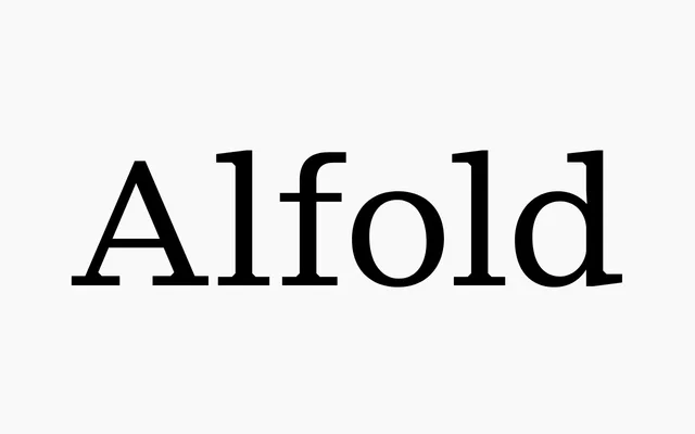
A toned-down contemporary serif from a 1936 Subotica magazine, in proportional, semi-mono and mono cuts of nine weights each.
About
Alfold takes its name and starting point from Alföld, a magazine printed in Subotica in 1936, and turns it into a quiet modern serif for web, interface and editorial work. The upright workhorse has tight spacing, flared terminals and flat serifs with rectangular connectors; Semi-Mono borrows monospaced spacing for text, logos and headlines, and Mono is the fixed-width display cut. Each runs from Thin to Black with a variable font and a 560-plus character set.
Classification
A neutral contemporary serif with flared terminals and flat serifs joined by rectangular connectors, named after and drawn from Alföld, a magazine published in Subotica in 1936. It comes in proportional, semi-monospaced and monospaced cuts.