 MegaMegaTypeType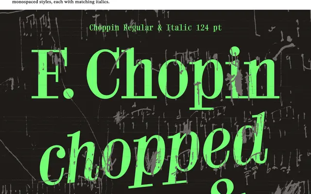
A contemporary Didone serif designed for the 63rd season of the Chopin Concerts in Warsaw, now released in proportional and monospaced styles each with matching italics.
About
Choppin takes the Didone serif as its starting point, adding a generous x-height, sharp detailing and interconnected serifs that give it a distinctly modern character. Its proportions were derived from a five-line grid, referencing musical notation and the context of its commission. The family covers both proportional and monospaced styles, each accompanied by an italic.
Classification
A contemporary Didone serif characterised by high stroke contrast, sharp detailing and interconnected serifs, placing it firmly within the modern/Didone tradition. The generous x-height and five-line grid proportions give it a distinctive editorial quality.