 MegaMegaTypeType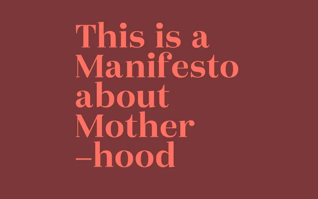
A Didone text family in five weights, drawing on Enlightenment-era rationalism and designed for editorial use from headlines to short body text.
About
Okaasan® Serif pairs high stroke contrast with a contemporary sensibility, sitting within the Didone tradition established by the rational type of the 1800s. Five weights from Light to ExtraBold give the family sufficient range for editorial hierarchies, and Vietnamese diacritics broaden its language coverage beyond standard Western and Central European scripts. The conceptual inspiration draws from the Venus of Willendorf and the archetype of motherhood, reflected in the typeface's name – 'okaasan' meaning 'mother' in Japanese.
Classification
High contrast between thick and thin strokes with a rational, structured approach places this squarely in the Didone tradition, inspired by the Enlightenment-era modern roman style of the 1800s.