 MegaMegaTypeType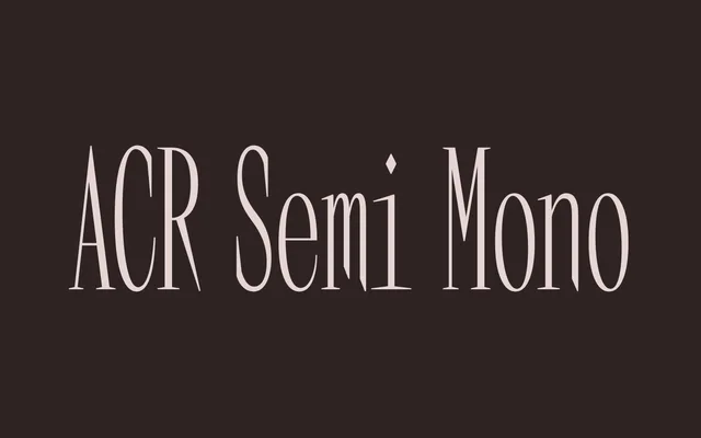
A condensed serif of four styles that began life as a monospace, keeping an even rhythm without fixing every width.
About
Four styles: Regular and Bold with true italics drawn on their own terms rather than slanted. Terminals taper subtly and the proportions stay condensed, which suits headlines and large settings more than body text. The even spacing left over from its monospaced start gives it a steady, mechanical rhythm.
Classification
Serifed with subtly tapered terminals, so it sits in the serif category despite its name. The monospaced origin survives as even, near-fixed rhythm rather than true fixed widths, which is what the foundry means by semi-mono, and the proportions are condensed throughout.
Weights
RegularBold
Languages
Latin
Tags
serifcondensedsemi-monodisplaypostereditorialitalic