 MegaMegaTypeType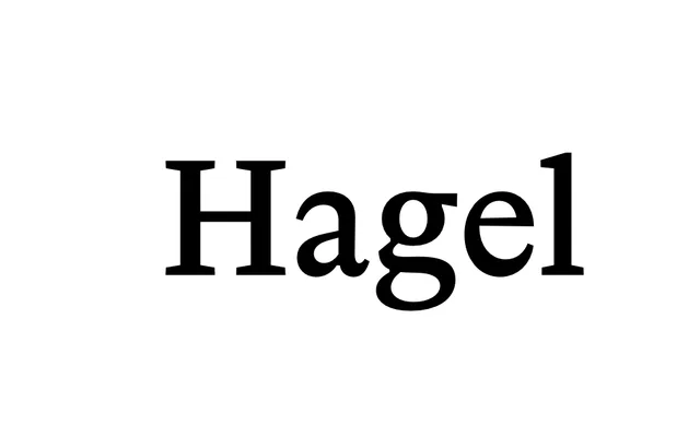
A contemporary serif by Christian Gruber designed for continuous reading, with sharp detailing that becomes expressive at larger sizes.
About
Conceived first as a text face, Hagel holds its composure in long-form reading while revealing finer tensions and crisp detailing when set large. Version 2.0 takes it from a single weight to six, Regular to Black, each with a matching italic, and the heavier cuts push it further into display work. A single Hagel Mono sits alongside, sold separately from the family package, with broad Latin Extended coverage throughout.
Classification
Described by the foundry as a contemporary serif designed for continuous reading, with sharp detailing that becomes apparent at display sizes. The design sits between text and display use, consistent with a contemporary or transitional serif classification.