 MegaMegaTypeType
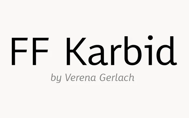
A characterful contemporary sans by Berlin designer Verena Gerlach, developed for FontFont between 1999 and 2011 with a Display companion.
About
FF Karbid has an angular, slightly rough-edged personality that keeps it from feeling generic. The text cut handles small sizes and screens, while FF Karbid Display tightens things up for headlines. It suits branding, cultural posters, magazines and websites.
Classification
Contemporary sans with a squarish, slightly hand-built character, developed by Verena Gerlach between 1999 and 2011. Five weights with italics, plus a Display cut; part of a superfamily that also includes FF Karbid Slab and FF Karbid Text.
Weights
LightRegularMediumBoldBlack
Optical sizes and widths
Display
Family
FF Karbid Display
Languages
Latin
Tags
sanscontemporaryberlinbrandingeditorialscreen