 MegaMegaTypeType
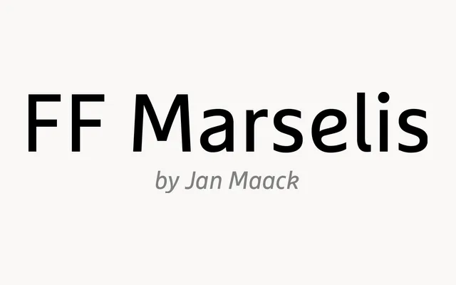
Jan Maack's geometric-humanist sans with gently bowed diagonals, one of Typographica's favourites of 2012.
About
FF Marselis looks geometric at first glance, but its open counters and outward-curving diagonals give it a springy, friendly character. Small trims, such as the missing spurs on b and q, keep the texture clean. Four weights with italics suit brand identities, packaging and web interfaces that want warmth without going soft.
Classification
Sans by Danish designer Jan Maack that crosses geometric and humanist construction, released through FontFont in 2012. Open counters throughout and no spurs on b or q. The diagonals in A, K, R, V, W, X, Y and Z bow slightly outwards. Selected as one of Typographica's favourite typefaces of 2012.
Weights
LightRegularBoldBlack
Languages
Latin
Tags
geometrichumanistbrandingfriendlyscreencontemporary