 MegaMegaTypeType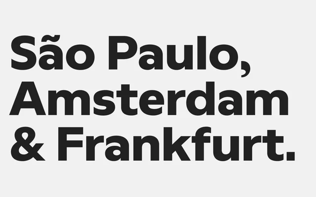
A four-designer geometric sans from Latinotype, released in 2025, offering eight weights with matching italics across 16 styles aimed at branding and screen applications.
About
Round, compact letterforms with selectively geometric characters give Better Sans a warm approachability that distinguishes it from colder geometric sans-serifs. Eight weights from Thin to Heavy, each with an italic, provide sufficient range for headline and body use in digital and print contexts. The design targets technology and consumer brands seeking a legible, characterful typeface for interfaces and advertising.
Classification
A geometric sans-serif with round, compact letterforms and integrated geometric shapes, tempered by warmth to avoid pure cold geometry. Sits in the tradition of friendly geometric grotesques suited to branding and screen use.