 MegaMegaTypeType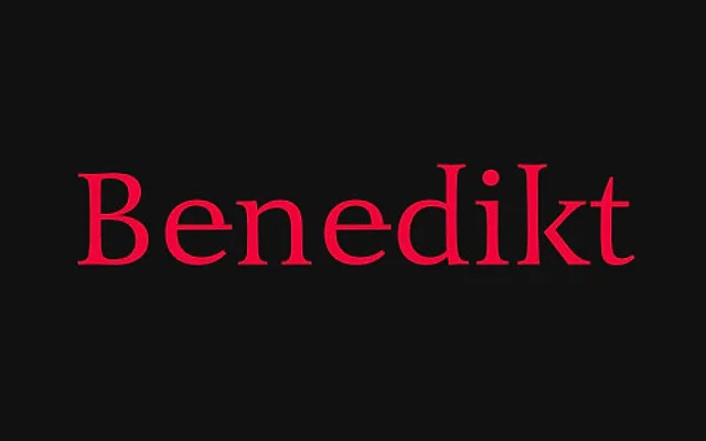
A Renaissance antiqua rooted in Roman monumental inscriptions, pairing upright letterforms of columnar, symmetrical character with italics derived from 6th-century wax tablet handwriting rather than the familiar 16th-century calligraphic model.
About
The upright styles originate from custom stainless steel capital lettering for the Hans-Benedikt foundation in Augsburg, carrying an inscriptional quality through to the lowercase with symmetrical structure and an uppercase R on x-height. The italic breaks from convention by rejecting Renaissance calligraphic sources in favour of the slender, low-contrast forms found in Roman wax tablet script, creating a pairing that is historically grounded yet visually unexpected. OpenType features include contextual alternates, six g-variants, old-style and lining figures in both proportional and tabular cuts, and true small caps with full diacritic coverage for over 36 languages.
Classification
A Renaissance antiqua rooted in Roman monumental capitals, with upright letterforms retaining the columnar, symmetrical character of inscriptional Roman writing. The italic departs from 16th-century calligraphic convention, drawing instead from Roman wax tablet handwriting of the 6th century, producing a low-contrast slanted form distinctly unlike typical Renaissance italics.