 MegaMegaTypeType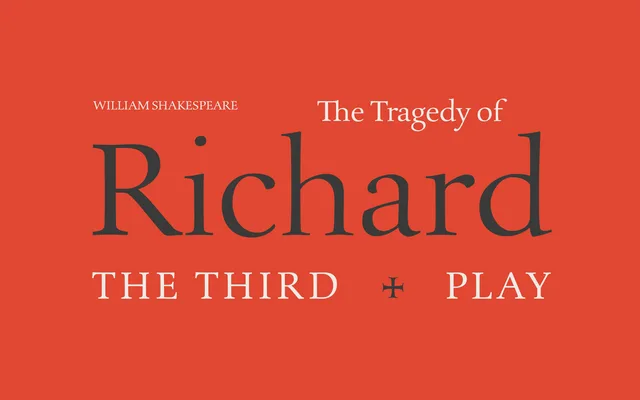
A two-weight Roman serif drawing on Renaissance forms, designed without an italic and intended to pair with an existing chancery-style companion.
About
Voltaire's even colour, moderate contrast and open counters make it a considered choice for extended text setting, while its classical proportions hold up in display contexts without compromise. The deliberate absence of a companion italic is a design statement rather than an omission: the family is conceived as a steady Roman to be set against a more expressive external chancery italic. Two weights, Light and Regular, cover the core range for book typography.
Classification
A single-style Roman drawing on Renaissance forms with moderate contrast and calligraphic influence, placing it firmly in the humanist or Venetian serif tradition suited to book typography.