 MegaMegaTypeType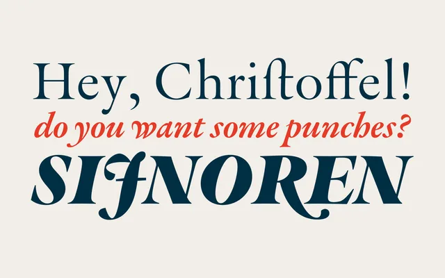
A Granjon-style Garalde text family developed from first-hand study of punches and matrices at Museum Plantin-Moretus, spanning four optical sizes, seven weights and matching italics.
About
Developed through direct observation of Robert Granjon's original punches, matrices and printed material in Antwerp, Graveur captures the overall character of the 16th-century French punchcutting tradition rather than reproducing a single source verbatim. The family stretches across four optical sizes (Small, Text, Subhead and Display), seven weights with italic companions, an ornaments font and two variable fonts, totalling 59 styles. A rich OpenType feature set includes old-style figures, discretionary ligatures, swash alternates, small capitals, long s, scribal abbreviations and historical forms. Awarded Gold in the Text Typefaces category at the 2022 European Design Awards.
Classification
A Renaissance-style text face in the tradition of Robert Granjon, placing it firmly within the Garalde category. The design draws directly from 16th-century French punchcutting, with optical sizes, swash alternates, long s and scribal abbreviations reinforcing its historical classification.