 MegaMegaTypeType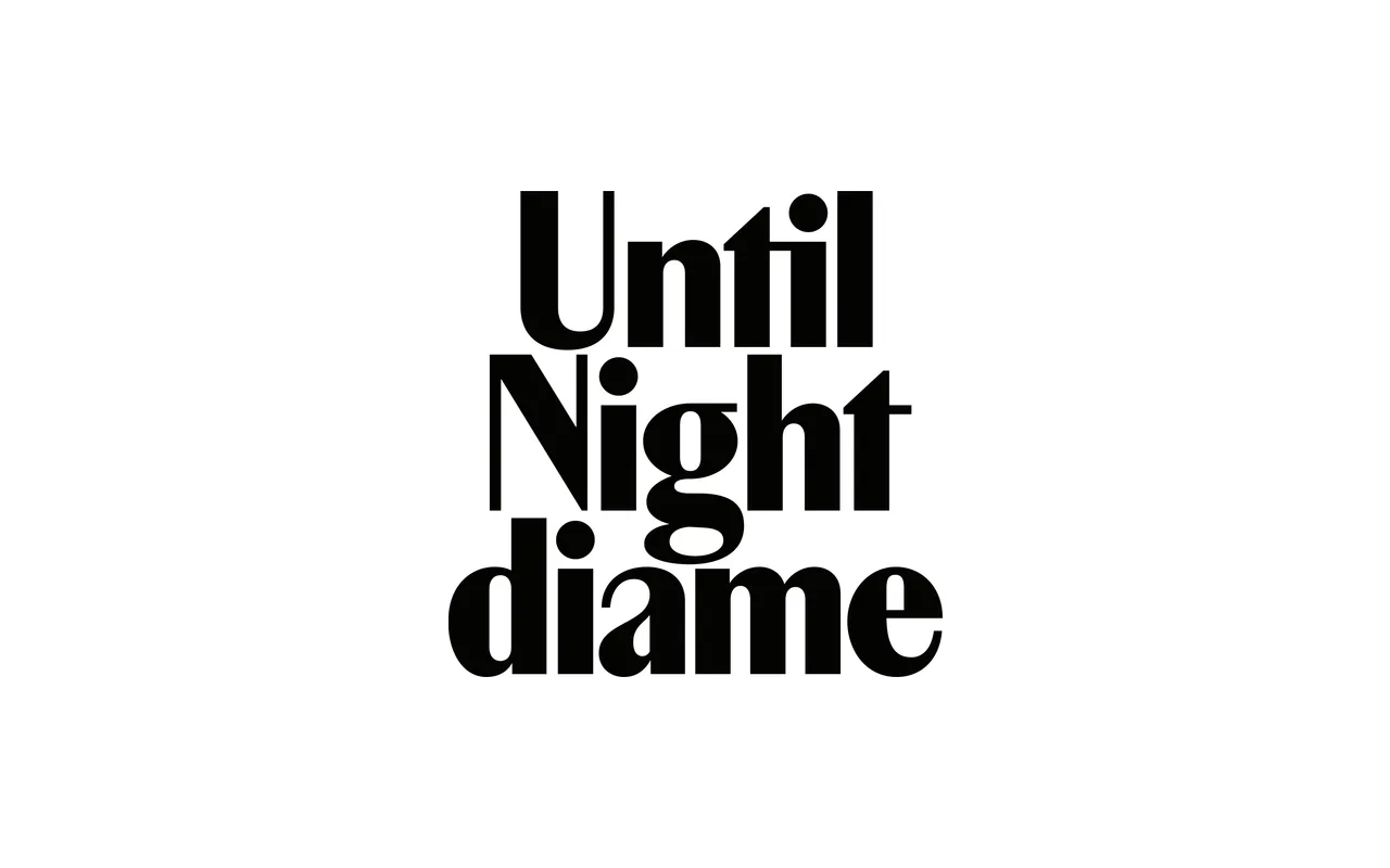
A condensed display serif in four styles, built on early 20th-century press type proportions and accompanied by a fully redrawn sans counterpart.
About
Marlfield began as a single Bold weight conceived for magazine covers and large headlines, where its compact, high-contrast forms and tight spacing command attention at scale. It grew into a small family of four styles: Regular and Bold serifs alongside Sans Regular and Sans Bold, each redrawn to maintain internal coherence rather than simply stripped of serifs. Quiet affinities with French lettering of the 1930s to 1950s, particularly Peignot and Chambord, give it a historical resonance without direct imitation.
Classification
A condensed high-contrast display serif with a companion sans, drawing on early 20th-century press typeface proportions. Its compressed construction, high x-height and shortened extenders place it firmly in the display category, with serif and sans subfamilies sharing a common structural logic.