 MegaMegaTypeType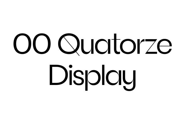
A high-contrast display cut of the 00 Quatorze geometric sans, pushing stroke differentiation to its limit with hairline connections across six weights.
About
Where the base 00 Quatorze family sits on a relatively neutral geometric foundation, the Display style amplifies contrast dramatically, producing hairline connections that give large-scale settings a striking, almost calligraphic tension. Humanist touches from the parent family carry over, including the single-storey g and u-shaped y, which soften what might otherwise be a severe construction. Six weights, each with a matching italic, make it adaptable across editorial and typographic display contexts.
Classification
A high-contrast display variant of a geometric sans-serif, with pushed stroke contrast, hairline connections and expressive details. Its extreme weight differentiation places it firmly in the display category despite its geometric sans origins.