 MegaMegaTypeType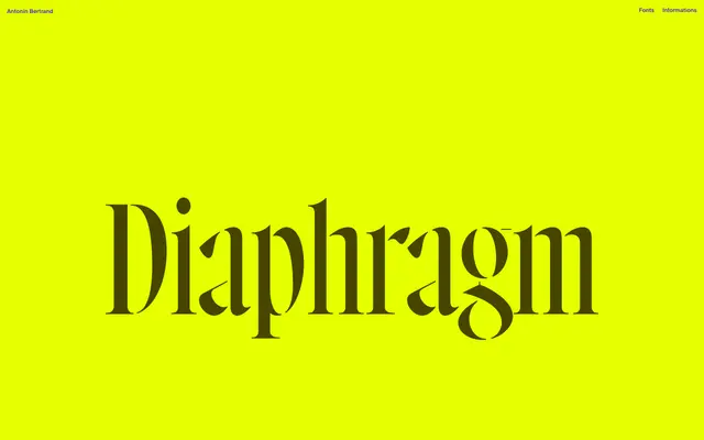
A condensed high-contrast display serif offered in Regular, Open and Stencil variants with progressive stroke erosion.
About
Diaphragm draws from Howland, an 1892 display typeface combining vertical and diagonal stress, though it has shifted considerably towards something more contemporary. The letterforms push hairline contrast to its limits and feature terminals that sit between ball and sharp serif forms. The Open and Stencil variants introduce progressive stroke erosion – gaps that widen incrementally between strokes – making the stencil concept structural rather than decorative.
Classification
A high-contrast condensed serif designed exclusively for display use, rooted in Howland (John F. Cumming, 1892) but evolved into a contemporary form. The terminals fall between ball terminals and sharp serifs – an unusual intermediate. The Open and Stencil variants use progressive stroke erosion rather than a conventional stencil break.